Typography has the ability to communicate important information to a range of audiences through their style. The type of font choses has the ability to ensure that passages of text are clear to read and understand. There are many factors that can affect this, especially for people who have a visual impairment.
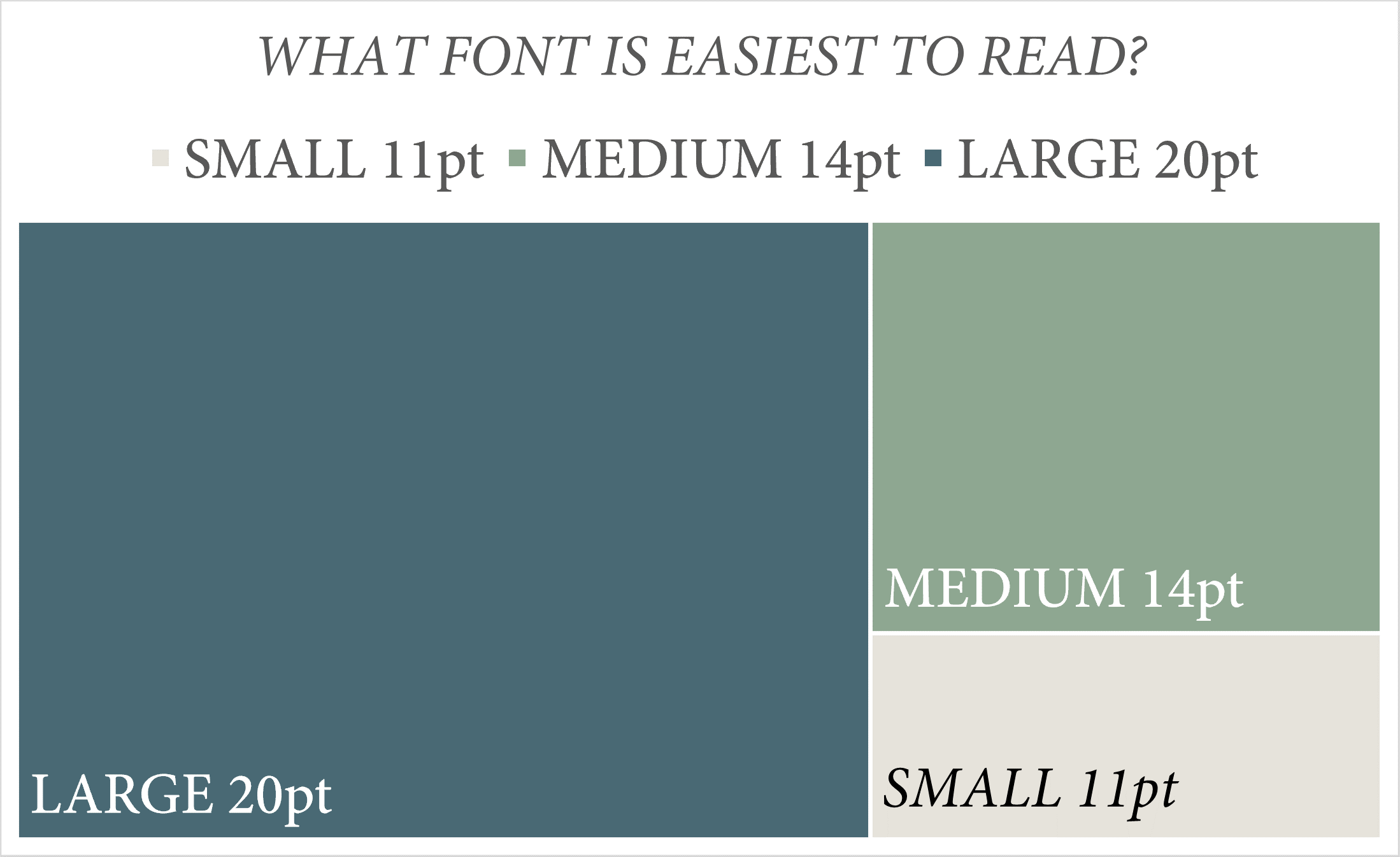
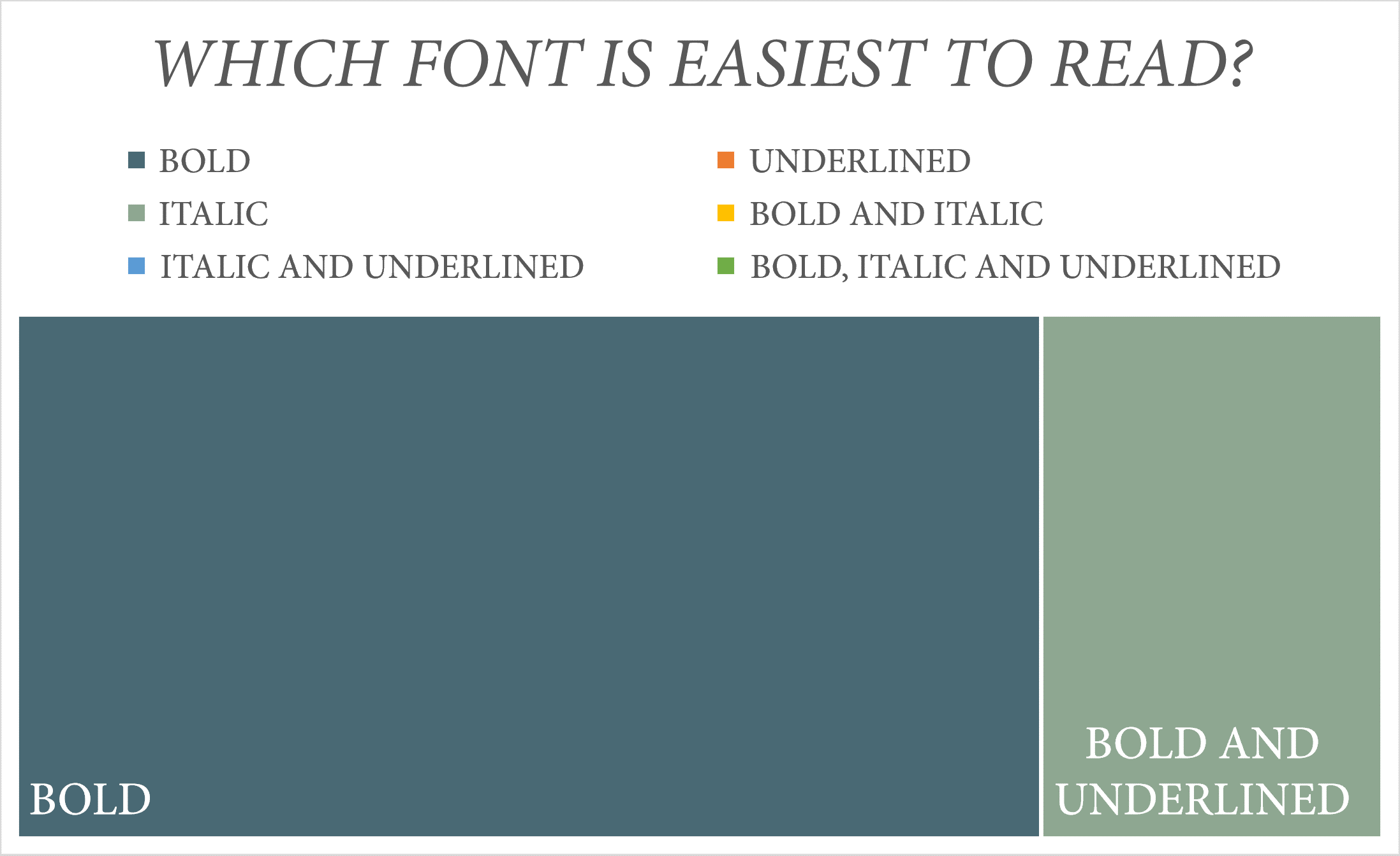
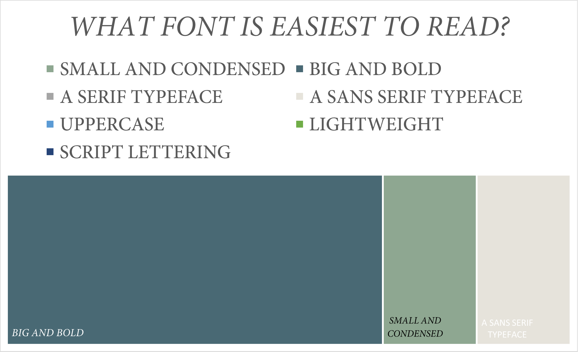
After conducting primary research the results showed that those with normal eyesight preferred text that was big and bold, preferably between size 14 and 20pt. They also preferred the text that was bold or bold and underlined. They found that the text that was black on white background or white on black background easiest to read and green on a red colour background the hardest. Those who have normal vision say they have never experienced lack of accessibility and after asking if they preferred text in digital or print format some suggested that digital print is easier to read as the user is able to zoom in as needed and enlarge text if too small. Furthermore, the brightness and the contrast can be altered. However, others suggested that text on printed documents is easier to focus on, especially with a black and white contrast, suggesting it causes less fatigue than staring at a screen for long periods of time as there is no glare and a high amount of screen exposure can hurt your eyes over time. After asking their thoughts about accessibility, many people who have normal vision suggest that they did not think that information is just as accessible to those with visual impairments because many sources of information do not have different accessibility options. They think that it will take them longer to understand the message as information is generally presented in a way that looks well, with a font size that allows all the information to be included. They provided an example that in society menu boards and transport timetables use mainly small fonts with very little spacing between the lines, which may be difficult to see especially at a distance for those who are visually impaired. It may not take into account those with visual impairments with regards to colours and font size. They think that when designing most people focus on its design, style and layout. They further explained that there is the potential for the designer to have a natural bias, especially since the content will already be familiar and understood, rather than thinking of the person seeing it for the first time with no foreknowledge or understanding of the content which is being presented. Therefore this can have a negative effect on someone with visual impairment as they will have to discern what is being said within the choice of design. On the other hand, some argued that any vital information is usually very accessible as they would use large, bold fonts and contrasting colours. They suggested that websites often have accessibility features such as dark/light contrast mode, immersive reader and the ability to alter font size. Those who have normal vision say that they are aware of many factors that could have an impact on the readability of text. They provided examples of what could affect this such as font type, size, weight and colour. They also said that the background colour whether the text is serif or sans serif the kerning, layout and the use of graphics can further have an impact on how hard text is to read. They are aware of how medical issues can cause visual impairments and some think people with visual impairments are discriminated against and are aware that more could be done to raise awareness. Furthermore, some of the people I asked were aware that some medical issues can affect vision and suggested that stroke can affect vision on one side and may struggle with visual processing in particular being able to recognise and understand what they are being shown, especially in a timely manner. Another example is that diabetes can cause blurry vision and blindness can be genetic. They explained that accessibility may have different requirements for different disabilities and many impairments are not comparable. Some think that society can hold the misconception that anyone who is visually impaired might be hard to employ or not of use within their workplace due to potentially taking longer than average to process information when they might just require simplified visual aids to do so. They suggested that further information should be provided publicly regarding these specific issues to avoid discrimination as perhaps those who are visually impaired make up a small proportion of the population and therefore are not considered when designers are trying to create the best they can to appear to the general population. However, they think some designers are more concerned about how a product looks rather than the design meeting the purpose that the information is easily identifiable and easily understood and are unsure why designers can present information aesthetically while helping those with visual difficulties. However, some were not aware that there was discrimination to those with visual impairments and that simple there is a need to become better informed of the issue and how to be addressing it as people are not aware of these issues unless it affects them. They think that only those within professions where they come into contact or work alongside people who are visually impaired have received proper training and understand the need and benefits of the use of typography in order to assist daily tasks of those with the disabilities. They suggest that typeface and accessibility should be a topic focused on more particularly in secondary school to raise awareness and allow people entering the workplace to make improvements in all fields in order to increase accessibility for those with disabilities for example making large font signage or using colours which are more easily seen. On the other hand, some argue that there is not a huge level of discrimination as often websites include accessibility features and have never realised that there was an inaccessibility for people with disabilities in regards to fonts. They also would suggest that some medical issues cause focusing to be an issue due to pain and headaches, therefore there isn’t a case of discrimination and more a lack of awareness.


