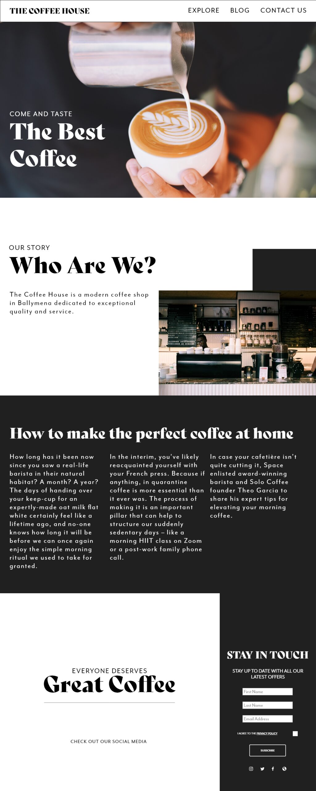
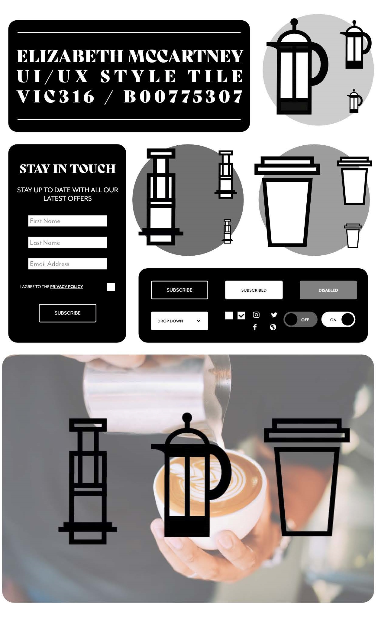
After being inspired by my research and my original ideas, I decided on a final wireframe for my theoretical coffee shop. I decided to keep the colours black and white throughout to maintain consistency and provide a minimal and professional feeling throughout the user interface. This will suggest that the coffee shop will be good value for money, which will appeal to students and the neutral colour palette will appeal to both genders.
When designing a user interface it is important to adapt the content to different screen sizes – this might require the information to be reconfigured.
For my mobile version I followed examples from my research and used a one column grid and 414px width. This made the typography readable, accessible and the website aesthetic. The font size I chose was slightly bigger so it could be easily read on screen (around 22pt) and the leading was four point sizes bigger. The layout was different as the content needed to be stacked vertically on top of each other instead of being horizontally aligned.
As well as this I created a desktop version with width 1280px. On my desktop I had a working navigation panel. When you click on the tabs (that have a roll over effect on them) the RWD will automatically scroll to the content selected.
You can see the final versions of my RWD below. On the left we have the scrolling desktop and on the right is the adjusted layout to fit a mobile device.
The layout has been changed from three columns in the desktop view to one single column and the positioning of the images has also been altered.
I have maintained consistency throughout by using the same typeface, images and colour scheme throughout. I have also kept the name of the website obvious in the top centre position of the navigation bar.
